
This post is part of a weekly series reviewing higher-education websites through the lens of prospective students and families, focusing on the information they need from a website and how well institutional sites help them find it. Reviews are published in a spirit of collegiality and support. If you notice an inaccuracy or have an issue with a website review, please get in touch.
See more college and university website reviews.
This Susquehanna University website review looks at the undergraduate admission experience from two vantage points: the prospective student deciding where to spend four important years, and the parent quietly running the numbers in the next room. Susquehanna is a small private liberal arts university in Selinsgrove, Pennsylvania, and its site does something many peers struggle with. It leads with the question families are most anxious about, which is cost, and it answers with warmth. The headline finding is encouraging: the harder emotional work is handled gracefully, while the friction that remains is mostly mechanical, the kind that a focused afternoon of cleanup could resolve.
Susquehanna University at a glance
- Location: Selinsgrove, Pennsylvania
- Type: Private, nonprofit liberal arts university
- Founded: 1858
- Total enrollment: Approximately 2,200 based on IPEDS data
- Athletics: NCAA Division III, Landmark Conference (River Hawks)
Summary of Susquehanna University Website Review
Clear strengths
- Cost anxiety is met head-on. The message that the sticker price is rarely the price a family pays appears early and often, backed by a dedicated affordability page, a net price calculator, and a plain claim that every student receives some form of aid.
- The path to apply is generous and low-friction. Students can apply through Susquehanna’s own application or the Common Application, there is no application fee, and the process is test optional.
- Outcomes are stated with confidence and evidence. A four-year graduation guarantee and a national ranking for graduate earnings give families a concrete answer to the return-on-investment question.
- Audience lanes are clear. First-year, transfer, and international students each get their own clearly labeled entry point, so visitors sort themselves quickly.
- The visual identity is warm and consistent. The maroon palette, generous photography, and calm layout carry a recognizable brand, and the contrast on primary text and buttons reads cleanly.
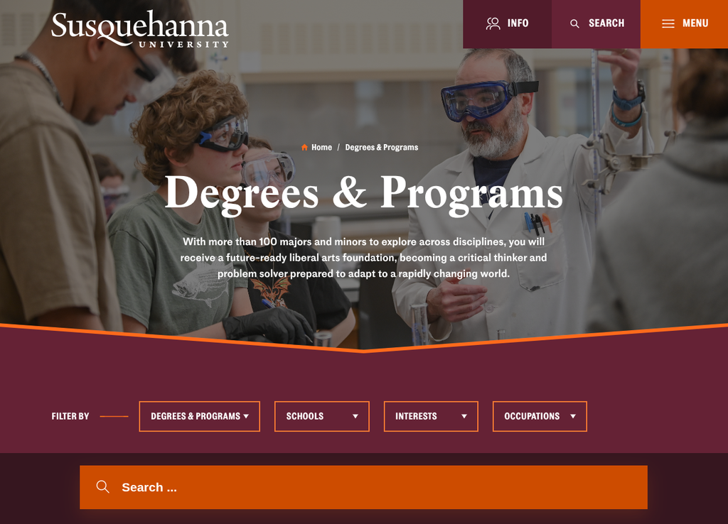
- Program discovery search is visually striking and user-friendly. The programs page renders dozens of majors inline, one after another, with a filter control and search function that is large and obvious at the top. It should be easy for students to identify a match.
Strategic opportunities
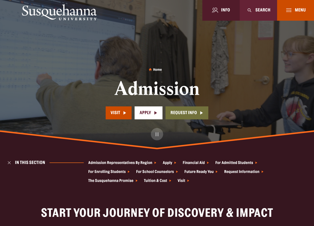
- A primary call to action does not lead anywhere. The “Apply Today” button at the bottom of the admission page points to the same page rather than the application, so the most motivated visitor hits a dead end at the moment of highest intent.
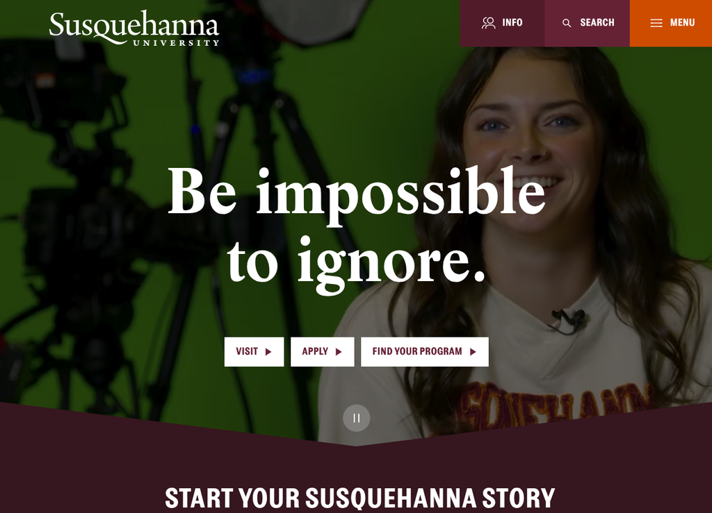
- The ambient hero video could use visible controls. An autoplaying background video sets a nice mood, but a clear pause control and captioning would serve visitors who prefer a calmer or more accessible experience.
- Some interactions are a little overwhelming. One example is when choosing the application type. The image animation effect is so strong and sudden that it could be startling.
- Program discovery search is limited to program names. The search function only returns results based on the title of a program. Exand the search capability to search descriptions to help students find and explore a wider range of programs.
Technical foundations
The public site runs on WordPress, which gives Susquehanna a flexible, widely supported foundation and a large pool of talent who can maintain it. The application and portal experience runs on a separate system, with a Slate-powered environment handling the deposit flow and the River Hawk applicant portal on a dedicated subdomain. This is a common and sensible split for a school of this size. The main advantage worth protecting is visual and verbal continuity, so that a student never wonders whether they have wandered off the official path as they move from marketing pages into the application itself. The footer carries the expected governance signals, including policies and disclosures, contact routes, and consistent social links.
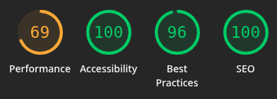
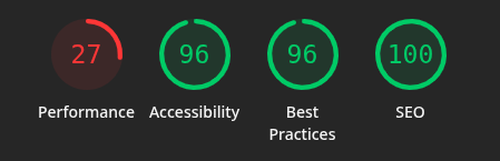
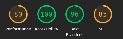
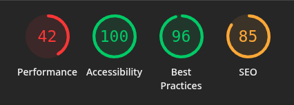
Lighthouse tells an encouraging story on the fundamentals and points to one clear area to watch. Accessibility is excellent everywhere, scoring 100 on both admission views and on the desktop home page, and 96 on the home page on mobile. Truly hats off to the development team for building such a strong, accessible experience. Best Practices holds steady at 96 across the board, and SEO is strong, reaching 100 on the home page. The area to watch is performance on mobile, which comes in at 27 on the home page and 42 on the admission page. Interestingly, the admission page outperforms the home page on performance at both sizes, 80 to 69 on desktop and 42 to 27 on mobile, so the heavier lift is on the home page rather than the deeper admission content. Many prospective students will arrive on a phone, so lifting mobile performance, likely by trimming and deferring the home page’s media, would be the single highest-value technical improvement, and it would build on an already sound accessibility and SEO foundation.
Information architecture and findability
For the tasks that matter most to a prospective student, the top navigation is well organized. Admission and affordability sit together under one heading, which mirrors how families actually think, and the visit, apply, and request-information actions repeat consistently near the top of the page. A student who arrives knowing roughly what they want will move quickly.
Program discovery is a particular strength. The admission section provides a program search, and it links to a dedicated academic programs page that pairs a search box with large, clearly visible filters. A student who wants to confirm whether a major is offered, or browse by area of interest, can answer that question in seconds rather than scrolling. This is exactly the kind of findability that supports the task families care about most after cost, which is whether the school teaches what the student wants to study. The primary improvement for program search is to include the program descriptions, careers, and related information in the search results rather than only the program name.
Cost, financial aid, and transparency
This is where Susquehanna is at its best, and for families it is often the center of the decision. The site names the cost concerns directly and reassures: the price you see is not necessarily the price you will pay. That single sentence does a lot of emotional work for a parent looking at a private-college sticker figure for the first time. From there, the site offers a clear route to an affordability explainer, a net price calculator, and a scholarships and grants page, along with the reassurance that aid reaches every student in some form.
The comparison the site provides (a Susquehanna education can end up comparable to or less than a public university once aid is applied) is the type of framing a cost-conscious family needs to understand early. The opportunity here is modest: bring the net price calculator and a plain total-cost-of-attendance figure even closer to that reassuring message, so a family can move from “we are reassured” to “here is our estimated number” without hunting. Cost transparency is most persuasive when the comforting claim and the concrete calculator sit side by side.
Accessibility, usability, and inclusivity
The site includes skip-to-content links and a dark-mode option, both thoughtful touches that signal attention to a range of visitors. Imagery is warm and varied, and the alternative text on many photographs is unusually descriptive, which helps both accessibility and search. A few opportunities would round this out. The autoplaying hero video would benefit from a visible pause control and captioning, so visitors who find motion distracting, or who rely on captions, keep full control of the experience. And because the program list runs so long, students using assistive technology or a smaller screen carry the heaviest version of that scroll. Tightening program discovery, as noted above, is an accessibility win as much as a usability one.
Executive lens: enrollment, risk, and governance
Enrollment and funnel
The funnel from awareness to application is mostly well supported. Visit, request information, and apply are always within reach, the affordability message lowers the biggest barrier early, and the audience lanes route students efficiently. The one issue that is easy to close quickly is the “Apply Today” link at the bottom of the Apply page that links to the same page. This is likely because there are two application paths — the Slate application and Common Application — which requires a decision point. A motivated student, however, who scrolls to the bottom, ready to act, is met with the same page that reloads. That is a conversion moment lost at the point of highest intent, and it is a fast fix.
Risk and compliance
Nothing here suggests elevated risk. The video and long program list are usability considerations more than compliance concerns, though addressing them strengthens the accessibility posture.
Governance and maturity
The site shows the signs of a mature, well-tended digital presence: consistent branding, descriptive image metadata, sensible information architecture, and a clean footer of policies and contacts. The small inconsistencies noted here are the ordinary residue of a large site maintained by many hands over time. They are easy to catch and easy to correct, and doing so would bring the mechanical polish up to the level of the site’s genuinely strong strategy.
Recommendations
- Fix the closing “Apply Today” button so it links to the application, recovering a conversion at the point of highest intent.
- Make program discovery search and filter to results that include the descriptive data for each program.
- Place the net price calculator and a plain total-cost figure alongside the affordability message, so reassurance and a real estimate live together.
- Add a visible pause control and captioning to the hero video, giving every visitor full control of the experience.
- Reduce some visual animations to be more subtle.
- Prioritize mobile performance on the home page, where the current score is the lowest of the four measured, since most prospective students arrive on a phone.
An invitation to collaborate
This series exists to help institutions serve students and families better, and to share what we notice as we look closely at how higher-education websites support the people using them. The observations here are offered in that spirit, as a colleague thinking alongside the teams who do this work, not as a verdict from the outside. If a closer, institution-specific look would be useful, we are always glad to talk through what we see and where the quickest wins tend to be.
Want to work together? Get in touch.
Disclaimer: This review is based on publicly available information at a specific point in time and reflects professional opinion offered constructively. Websites change frequently, and details may have shifted since publication. Institutions are welcome to submit corrections or updates, which will be incorporated promptly.