
This post is part of a weekly series reviewing higher-education websites through the lens of prospective students and families, focusing on the information they need from a website and how well institutional sites help them find it. Reviews are published in a spirit of collegiality and support. If you notice an inaccuracy or have an issue with a website review, please get in touch.
See more college and university website reviews.
This Columbia College website review looks at the traditional undergraduate admissions experience on ccis.edu from two vantage points: a high school student weighing options, and a parent helping that student decide. Columbia College serves a wide range of learners, from residential students on its Columbia, Missouri campus to online students and service members at locations across the country. The site handles that range with care in many places. It welcomes families by name, publishes cost scenarios that most sites leave out, and offers a clear set of next steps. The opportunity is for the student who is not ready for a next step yet. Without an admissions landing page, an exploring student is asked to choose an action before getting the lay of the land.
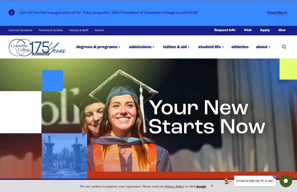
Columbia College at a glance
- Location: Columbia, Missouri, with online programs and more than 15 Columbia College Global locations
- Type: Private, nonprofit, nonsectarian college with a historic covenant with the Christian Church (Disciples of Christ)
- Founded: 1851 as Christian Female College; coeducational since 1970
- Total enrollment: More than 6,000 students annually across all locations, with about 1,400 on the Columbia campus; 5,000 – 7,500 band
- Athletics: Cougars, NAIA, American Midwest Conference
Summary of Columbia College Website Review
Clear strengths
- A “what kind of student are you?” selector on the home page lets undergraduate, graduate, military, online, and international visitors sort themselves quickly.
- Parents and families have a dedicated page written largely for prospective families, with its own request-for-information form.
- The cost of attendance page shows two academic years side by side in readable tables, including scenarios for living on campus, off campus, or with parents, plus separate net price calculators for residential and online students.
- The Undergraduate Admissions page states residential freshman requirements plainly and separates them from online, certificate, and dual enrollment paths.
- Visit options are current and varied, with fall 2026 open houses organized by academic school and a helpful list of questions to consider during a tour.
Strategic opportunities
- There is no admissions landing page. The Admissions menu offers specific actions, and I found myself wishing for a single page that simply explained how admission works before asking me to choose one.
- Two pages list different 2026-27 tuition for residential students, which could leave a family unsure which figure to plan around.
- The program finder cannot narrow results to programs offered on the Columbia campus, so a traditional student sees online and in-seat options together.
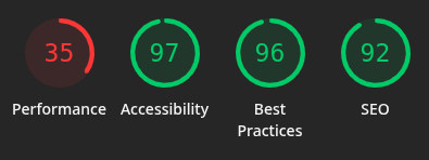
- Mobile performance (35 on the home page, 40 on Admissions) trails desktop by a wide margin, on the device many prospective students reach for first.
Columbia College Website Review: Technical foundations
Public signals on ccis.edu, including /index page paths and an /_images/ directory, are consistent with the Omni content management system, though the platform could not be confirmed from the outside. The application runs on a Salesforce portal at ccis.my.site.com, and visit events register through Salesforce Sites, giving the inquiry, visit, and application steps a shared foundation. Group visit requests use FormAssembly, and a self-guided virtual tour is hosted separately. Athletics lives at columbiacougars.com.
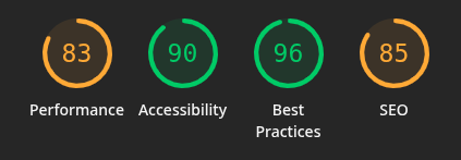
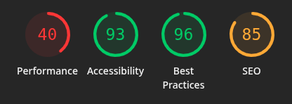
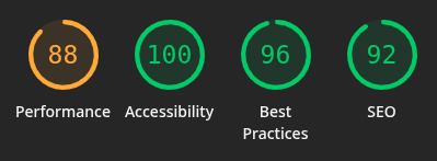
Accessibility is a clear strength, led by a perfect 100 on the home page desktop test and 97 on mobile. Best Practices holds at 96 across all four tests, and the home page earns a 92 in SEO on both devices. The most important pattern is the gap between desktop and mobile performance. The home page drops from 88 on desktop to 35 on mobile, and the Admissions page drops from 83 to 40. Those are the pages a student is most likely to open on a phone. Two smaller notes: SEO on the Admissions page sits at 85, below the home page, and its accessibility score is lower on desktop (90) than on mobile (93), a reversal that often points to elements that appear only in the wider layout.
Columbia College Website Review: Information architecture and findability
The main navigation is straightforward: Degrees & Programs, Admissions, Tuition & Aid, Student Life, Athletics, and About. The home page does much of the sorting work well. Its student-type selector sends a high school student to the Undergraduate Admissions page in one click, and a prominent “browse all programs” button opens the program finder.
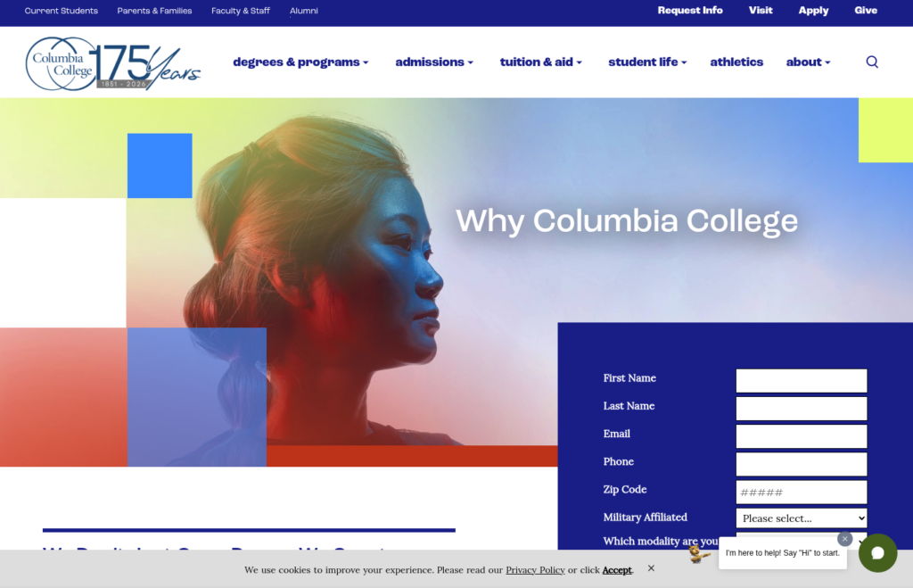
The Admissions menu tells a different story. It lists Why Columbia College, Partnerships, How to Apply, Admitted Students, How to Transfer, Refer a Student, and Visit. Each is useful, but each is a specific action or audience. The Admissions address itself does not open to a section landing page, a potential pillar content page to provide users with a summary view. A student who is simply curious, who wants to know how admission works, what it costs, and what happens next, has no single place to begin. The header’s Apply button goes straight to the application login, which suits a decided student and may feel abrupt to one who is still looking around.
The program finder offers filters for program level, area of interest, and format, with plain-language format labels such as “Almost all in a classroom, on a schedule.” Because many programs are tagged as both in-seat and online, a traditional student cannot narrow results to programs offered on the Columbia campus. Sorting through the results felt like more work than the filters promised.
Families are well served by comparison with many sites in this series. A Parents & Families link sits in the utility navigation and leads to a page that speaks to prospective families directly, with admissions, aid, and visit contacts and a request-for-information form built for parents and guardians.
Cost, financial aid, and transparency
Cost is often the center of the decision, and Columbia College publishes cost information in detail. The cost of attendance page, two clicks from the home page, shows 2026-27 and 2025-26 figures in readable tables. Residential students can compare living on campus, off campus, or with parents, and the annual on-campus total for 2026-27 is $48,132. Separate net price calculators for residential and online students help each audience find its own answer. The tuition model is also a clear value message: the tuition page says the price includes educational fees and books.
The opportunity is consistency. The cost of attendance page lists 2026-27 residential tuition at $14,677 per semester. The undergraduate tuition page lists the same year at $14,917 per semester, a difference of $480 over the year. The cost of attendance tables also include a books line, while the tuition page says books are included. Each figure may have a sound explanation, such as a budgeting allowance, but a parent comparing the two pages has no way to know that. A short note, or a single source for the residential rate, would let families trust the numbers they find.
Accessibility, usability, and inclusivity
Accessibility scores of 90 to 100 reflect solid work, and cost information is published in text tables rather than images. The Undergraduate Admissions page organizes requirements by path in plain language, which helps both first-year and adult applicants find their own section.
Inclusivity shows up in the breadth of paths offered. Military students, dual enrollment students, international students, and families each have a clear place on the site. The visit page’s “Questions to Consider” list covers topics such as safety, class size, and support services, which is the kind of guidance a parent appreciates.
The student request-for-information form asks for quite a list of information, including a birthdate, citizenship status, and consent to AI-generated calls and texts, along with program and start-term details. These fields likely serve a wide range of applicants and the needs of the college, but it comes to 16 fields for an initial request. For a high school student at the very start of a search, the form may ask more than expected, and almost certainly reduces the form conversion rate.
Columbia College Website Review from an Executive lens: enrollment, risk, and governance
Enrollment and funnel. The site is built for students who know what they want. The student-type selector, the Apply button, and the Request Info and Visit links all move a decided student forward efficiently. The gap is earlier in the journey. An admissions landing page would give exploring students and their families a place to orient themselves, which is often where interest becomes inquiry. It would also provide a pillar page for SEO and AI searchability purposes. Mobile performance shapes that early stage too, since a slow first visit on a phone can end a search before it begins.
Risk and compliance. Accessibility is generally strong. The main exposure is expectation risk around cost. When two pages publish different tuition for the same year, a family may budget around the lower figure and feel surprised later. Aligning the figures protects both the family and the college’s reputation for transparent pricing.
Governance and maturity. Inquiry, visit registration, and the application share a Salesforce foundation, which supports a connected experience. Cost content is current, with 2026-27 figures in place. Serving residential, online, evening, military, and global students on one site adds complexity, and the places where details drift, such as tuition figures and program format tags, are the natural seams of that complexity.
Columbia College Website Review Recommendations
- Give Admissions a landing page. A short overview of the paths to admission, what it costs, how to visit, and how to apply would welcome exploring students before asking them to choose an action.
- Align residential tuition across pages. Publish one 2026-27 residential rate, and clarify how books appear in the cost of attendance when tuition already includes them.
- Let students filter to the Columbia campus. A way to see programs offered in person in Columbia would serve the traditional students the residential experience is built for.
- Offer a lighter first step for early inquiries. A shorter form for students who are just beginning to explore could make it easier to start a conversation.
- Close the mobile performance gap. Bringing the home and Admissions pages closer to their desktop scores on mobile, and lifting Admissions SEO from 85, would help the site meet students where they search.
An invitation to collaborate
This series exists to share what prospective students and families experience when they come looking for answers, and to help institutions serve them well. If you lead marketing, enrollment, or digital strategy at a college or university and would like a deeper, institution-specific review, we are glad to help.
Want to work together? Get in touch.
Disclaimer: This review is based on publicly available information at a specific point in time and reflects professional opinion offered constructively. Websites change frequently, and details may have shifted since publication. Institutions are welcome to submit corrections or updates, which will be incorporated promptly.