
This post is part of a weekly series reviewing higher-education websites through the lens of prospective students and families, focusing on the information they need from a website and how well institutional sites help them find it. Reviews are published in a spirit of collegiality and support. If you notice an inaccuracy or have an issue with a website review, please get in touch.
See more college and university website reviews.
Coppin State University Website Review
This Coppin State University website review looks at the undergraduate admissions experience on coppin.edu from two vantage points: a high school student deciding where to apply, and the parent helping them weigh the cost. Coppin has a genuinely compelling affordability story, and much of it is told well. The site publishes a full cost of attendance with a net price calculator on the same page. The headline finding is that Coppin’s most distinctive cost message, in-state tuition for students from states without an HBCU, sits outside the path a family naturally follows when they go looking for the price.
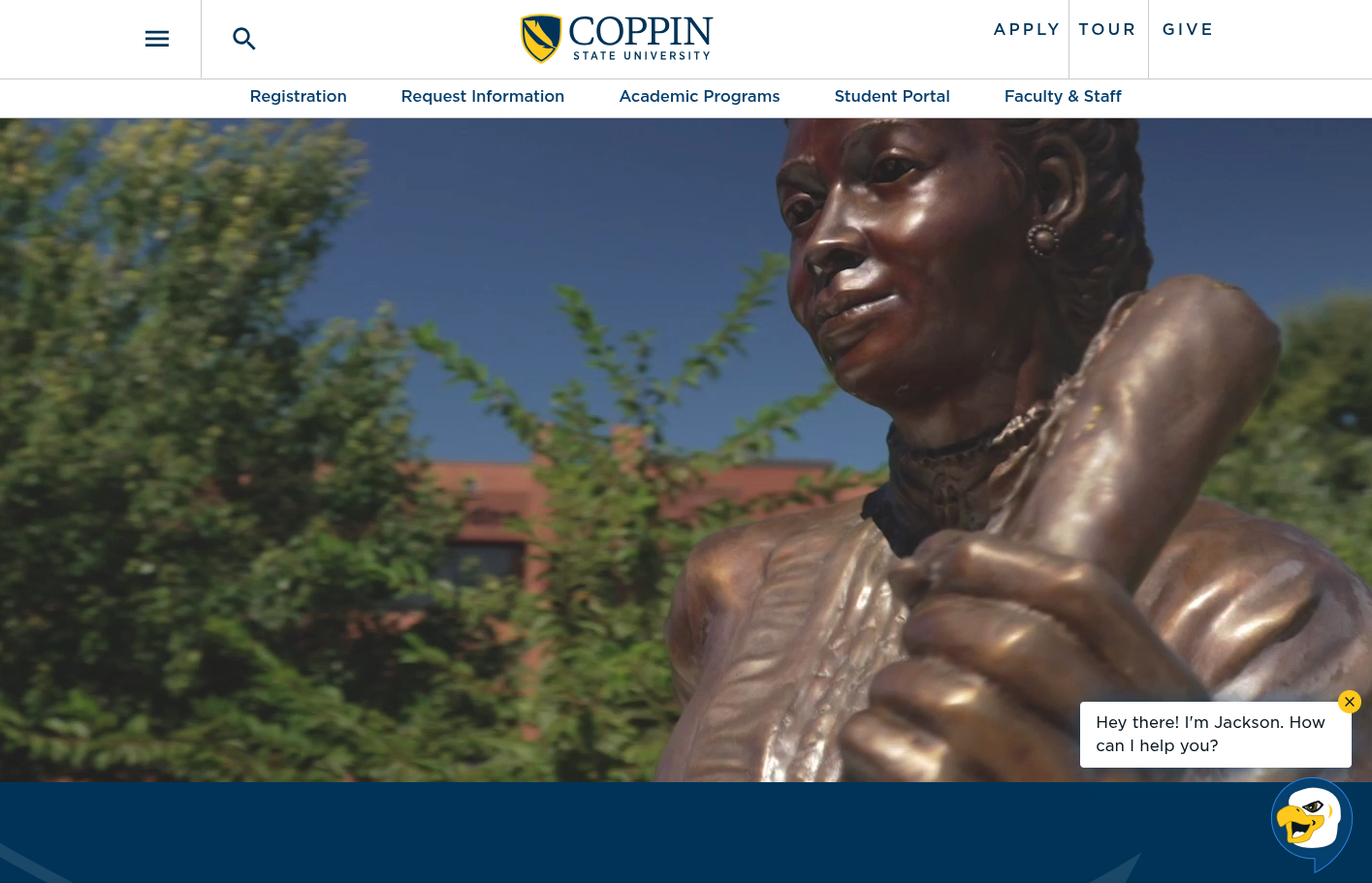
Coppin State University at a glance
- Location: Baltimore, Maryland
- Type: Public HBCU; member of the University System of Maryland
- Founded: 1900
- Total enrollment: 2,210 (fall 2024, IPEDS), including 1,907 undergraduates; less than 2,500 band
- Athletics: NCAA Division I, Mid-Eastern Athletic Conference (MEAC); the Coppin State Eagles
Summary of Coppin State University Website Review
Clear strengths
- Cost of attendance is published in detail, with direct and indirect costs explained in plain language and a net price calculator placed right on the same page.
- Apply, Tour, and Request Info stay close at hand throughout the site, and the home page closes with all three.
- The admissions experience feels personal. First-year counselors appear by name and photo alongside the states and counties they serve, so a parent knows exactly whom to call.
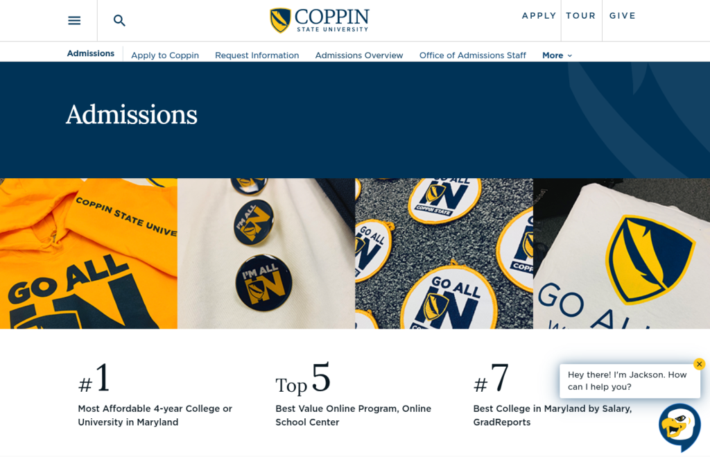
- The home page leads with proof points that matter to families, including recognition as the most affordable institution in the University System of Maryland and the safest residential university in Baltimore City.
- Accessibility scores are strong across the board, and the deep navy identity carries the brand with comfortable contrast.
Strategic opportunities
- Expand Eagle Nation, the in-state tuition incentive for students from eligible states, is absent from the Cost to Attend and residency pages, where an out-of-state family would most likely look for it.
- Several date-stamped details have aged in place, including an application labeled for 2025 and test-optional language that references 2023 applicants. Reading them as a parent, I found myself wondering which information was still current.
- A sitewide “What You’ll Need to Apply” panel mixes graduate-only requirements into the undergraduate journey.
- Admissions is a top-level navigation that many users will expect to find quickly. It is only navigable as a sub-menu under the hamburger menu. Making this easier to find will reduce user experience friction.
- The most recent cost figures shown are for 2025-2026, and five of the six undergraduate scenarios for that year appear as images rather than text tables, posing an accessibility issue and usability roadblock.
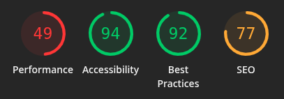
- Mobile performance and a uniform SEO score of 77 point to template-level improvements that would benefit every page at once.
- Navigation spacing is a little inconsistent (Apply / Tour / Give secondary navigation and section navigation); this is a design note that is easily fixed with CSS adjustments.
Coppin State University Website Review: Technical foundations
Coppin runs on Drupal 11, a current and well-supported release that gives the institution a solid platform for future work. Request Info, campus visit scheduling, and the application all live at apply.coppin.edu, with URL patterns consistent with Technolutions Slate. Google Tag Manager is present. The net price calculator is hosted by MeadowFi, and the virtual tour runs on a third-party tour platform. The footer carries healthy governance signals: accessibility, privacy, policies, and Title IX links, along with a clear statement of University System of Maryland membership.
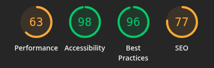
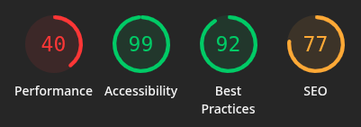
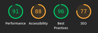
The Lighthouse results tell a clear story. Accessibility and best practices are strong, with accessibility ranging from 88 to 99 and best practices from 92 to 96. The admissions page outperforms the home page on both desktop (91 compared with 63) and mobile (49 compared with 40), which suggests the underlying template is capable of fast delivery and that the home page’s video and carousels account for much of the difference. SEO holds at exactly 77 on all four tests. A score that identical across different pages usually points to a shared, template-level pattern rather than page-by-page issues, and that is good news, because a single fix can lift the whole site.
Coppin State University Website Review: Information architecture and findability
The main navigation is organized in a way prospective families will recognize: Academics, Admissions, Student Life, Tuition and Aid, Research, and About. This main navigation is under a hamburger menu, even on desktop, so some users may not click there first. The main headings appear clickable, but don’t take the user to that location. The Apply link is available anywhere on the site. Cost of attendance is two clicks away, through Tuition and Aid. Tours are equally easy to reach through the persistent Tour link, and the visit page offers a scheduler, a virtual tour, and practical resources for parking, dining, and nearby hotels. The visit page’s “Upcoming Recruitment Events” link did not display any events at the time of review.
The All Academic Programs page groups offerings by area of interest, such as Business, Education, and Nursing and Health Sciences, and labels each program by level. That grouping helps a student who knows what they care about but not yet what the major is called. Undergraduate and graduate programs appear side by side within each group, however, and there is no way to filter by level. A high school senior has to read past MS and DNP listings to find the bachelor’s options.
On the Undergraduate Admissions page itself, deadlines are at the top of the page, but may be easily overlooked: March 1 for fall priority and December 1 for spring. Program-specific admission requirements for Nursing, Health Information Management, Social Work, and Education are listed, which helps, although the list does not link to the programs themselves. The sitewide “What You’ll Need to Apply” panel lists a $50 fee and three letters of recommendation, each marked “grad only.” The labels are accurate, but a first-generation student scanning quickly may reasonably wonder whether those items apply to them.
Cost, financial aid, and transparency
Cost is often the center of the decision for families, and Coppin handles much of it with real care. The Cost to Attend page explains the difference between direct and indirect costs in plain language. It notes that the cost of attendance is also the ceiling for aid, and it breaks out six undergraduate scenarios by residency and living arrangement. A Maryland resident living on campus can see an estimated 2025-2026 total of $27,410 for the year, line by line. The net price calculator sits at the bottom of the same page, which is exactly where a parent wants it.
Three refinements would make this strong page stronger. First, the most recent figures shown are for 2025-2026, so a family planning for fall 2027 is working from last year’s numbers. Second, only one of the six 2025-2026 undergraduate scenarios is a text table; the other five are images. Images are harder to read on a phone, cannot be searched, and depend entirely on alt text for screen reader users. The 2024-2025 figures below them, by contrast, are all accessible tables. Third, the column headings read “12 Semester Hours” and “24 Semester Hours.” Labeling them “per semester” and “per year” would remove a moment of doubt.
The larger opportunity is Expand Eagle Nation. Since 2024, Coppin has offered in-state tuition to new undergraduates from eligible states and territories without an HBCU, and the rate holds for the full degree. For an out-of-state family, that can cut tuition by more than half. The Admissions Overview page answers common questions about the incentive, and a dedicated page with an eligibility map lives under the Division of Enrollment Management and Student Affairs in About. Neither the Cost to Attend page nor the How Residency Decides Tuition page mentions it, however. A parent in Ohio or New Jersey who reads the residency criteria, which call for a Maryland driver’s license, tax return, and voter registration, could easily conclude that out-of-state rates apply to their student. The incentive is a standout affordability message, and it deserves a place on the pages where families do the math.
Accessibility, usability, and inclusivity
Coppin’s accessibility posture is visible and largely healthy. A skip-to-content link, a footer accessibility page, and scores of 94 to 99 on three of the four Lighthouse tests all speak well of the platform. The admissions desktop score of 88 is the one outlier and worth a closer look. Placeholder navigation items that link nowhere and image links without descriptive text appear across templates, and patterns like these commonly affect both accessibility and SEO audits. On the cost page, one doctoral cost image carries alt text describing a different scenario, a small slip that matters for screen reader users.
Inclusivity shows up in the content in meaningful ways. The residency page addresses DACA students and the Maryland Dream Act directly. The admissions menu offers distinct paths for transfer students, adult learners, military service members and veterans, and international applicants. The counselor profiles, organized by recruitment territory, give families a human point of contact from the very first visit.
A few date-stamped details work against that welcome. The application link is labeled “Spring/Fall 2025 application.” The test-optional note refers to students applying for Spring or Fall 2023. The home page’s campaign message invites giving “through 2025.” None of these is likely to stop a determined applicant, but together they can leave a family unsure which information reflects the current cycle.
Coppin State University Website Review from an Executive lens: enrollment, risk, and governance
Enrollment and funnel. Coppin is in a period of remarkable growth, with its largest incoming class in university history this fall. Out-of-state recruitment through Expand Eagle Nation has been a meaningful part of that story. The site’s Request Info, Visit, and Apply calls to action are consistent and easy to find. Carrying the in-state incentive into the cost and residency pages would help the site support yield as well as it supports inquiry, particularly for families comparing Coppin’s price with offers from institutions closer to home.
Risk and compliance. Cost tables published as images, links without discernible text, and mislabeled alt text are areas where accessibility risk tends to accumulate over time. Aged admissions language presents a quieter reputational consideration, since an outdated test-optional statement could lead a student to misunderstand what is required of them. Mobile performance in the 40s on the home page also means that many prospective students, who often arrive on a phone, experience the slowest version of the site first.
Governance and maturity. The foundation is strong. A current Drupal release, consistent page templates, contact blocks for each office, and a clean integration with Slate all signal a mature platform. The date-stamped content that has aged in place is a common pattern on sites where content is authored across many offices, and it is the kind of issue that tends to resolve quickly once it is visible.
Coppin State University Website Review Recommendations
- Bring Expand Eagle Nation onto the cost path, with a clear callout and eligibility map link on the Cost to Attend and How Residency Decides Tuition pages, and consider it as a home page proof point.
- Refresh date-stamped admissions copy so the application label and test-optional language reflect the current cycle.
- Publish current-year cost figures and convert the image-based cost scenarios into accessible text tables, labeled per semester and per year.
- Adjust navigation spacing for consistency and link the clickable text to primary areas of the site.
- Tailor the “What You’ll Need to Apply” panel so undergraduate pages show undergraduate requirements only.
- Add meta descriptions and resolve placeholder links and empty image links at the template level to lift SEO and accessibility across every page.
- Lighten the home page for mobile visitors, for example with a lighter video treatment and deferred loading of carousel content.
An invitation to collaborate
These university website reviews exist to help institutions serve prospective students and families well and to share what we learn along the way. Every institution carries its own constraints, history, and priorities, and a public review can only see part of that picture. If you lead marketing, enrollment, or digital strategy at a college or university and would like a deeper, institution-specific look at your own website, we are glad to help.
Want to work together? Get in touch.
Disclaimer: This review is based on publicly available information at a specific point in time and reflects professional opinion offered constructively. Websites change frequently, and details may have shifted since publication. Institutions are welcome to submit corrections or updates, which will be incorporated promptly.