
This post is the first of a weekly series reviewing higher-education websites through the lens of prospective students and families, focusing on the information they need from a website and how well institutional sites help them do it. Reviews are published in a spirit of collegiality and support. If you notice an inaccuracy or have an issue with a website review, please get in touch.
See more college and university website reviews.
This Suffolk University website review is focused on the undergraduate admission website from two vantage points that matter most to enrollment: the prospective student and the parent. Suffolk generally makes it easy for families to find the information, and much of it is executed well on the website. The clearest opportunity sits in the one area families consider most strongly (cost) where the information is transparent but scattered across the site in a way that adds friction at a critical point.

Suffolk University at a glance
Location: Boston, Massachusetts (urban campus)
Type: Private, nonsectarian (no religious affiliation)
Founded: 1906
Total enrollment: 5,000-7,500 students
Athletics: NCAA Division III, Commonwealth Coast Conference (CCC); also affiliated with the Eastern College Athletic Conference (ECAC).
Summary of Suffolk University Website Review
Clear strengths
- A genuinely strong program finder. The “Find a Program” link with typeahead feature is available site-wide, including on deep interior pages. It lists majors in the language students actually use.
- Apply and Visit links are visible from nearly every page as part of the header, so the core funnel actions are never more than a click away.
- A prominent Net Price Calculator link is available near the bottom of the Admissions home page. At the NPC page, a confident affordability message is available, again near the bottom: “98% of new undergraduates received a scholarship”. This message may get a little lost in the flow, as users are more likely to go to the NPC before scrolling down far enough to see this important statistic. The NPC links out to a third-party calculator hosted at a clearcostcalculator.com subdomain.
- A well-developed “Information For” menu item addresses transfer, international, first-generation, veteran, and parents and families, among other populations.
Strategic opportunities
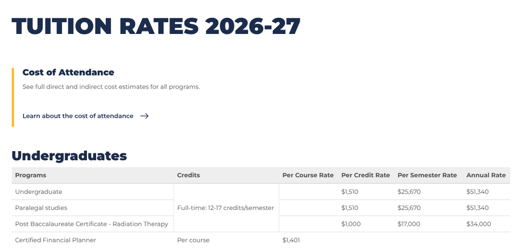
- The cost path is fragmented. The clearest tuition page lives under “About → Directory → Student Account Services,” a separate area of the website breaks from the familiar admissions site, which may be confusing for prospective families.
- Consider adding a link to the Net Price Calculator on the Cost of Attendance page. This is a logical next step that keeps the right information in front of the user, reducing friction to understand next steps.
- Published cost data, including 2026–27 tuition rates and an estimated cost of attendance page is available under both the Admissions section and the Student Financial Services section, so a user may find a different layout depending on the pathway, as there are different COA pages under different sections of the website.
- The admission navigation offers “Tuition & Aid,” but its “Cost & Tuition” sub-link moves the visitor out of the admission section into that administrative area, interrupting a potentially critical traffic flow.
- Cost, aid, scholarships, and the calculator are distributed across several sub-brands (Admission, Student Financial Services, Student Account Services), making it harder for a family to assemble one clear number.
- Heavy reliance on embedded interactive content on the admission homepage may add page weight and introduce accessibility and performance considerations worth measuring.
- A dedicated accessibility statement is not obviously surfaced in the global footer, though Disability Services and non-discrimination notices are present.
- The Financial Aid button from the undergraduate admissions page seems to be mis-linked, as it goes to a page about Admissions Videos.
Technical foundations
Suffolk’s public site runs on SiteCore, an enterprise content platform, with Google Tag Manager present for analytics. The undergraduate application is handled off-site through ApplyWeb, a common and reasonable pattern. The admission homepage leans on embedded interactive pieces for visual storytelling. The Net Price Calculator is hosted by a third party, which is a common practice.
Lighthouse scores for the Suffolk University home page and admissions page are shown below. The scores are respectable, especially on the Undergraduate Admission page, considering the embedded video elements used on the page. The home page does not use embedded video, but scores higher, which indicates there may be some easy wins to see performance improvements on the home page. At the top of the list would be image resizes and render-blocking resources, which are common culprits.




Information architecture and findability
This is a genuine strength. The “Find a Program” search follows the visitor everywhere and is present even on the tuition page, several clicks deep, still ready to help. Majors are labeled the way students think of them (“Computer Science,” “Marketing,” “Criminal Justice”) rather than in internal department language. That is user-priority design working as intended: naming the task, not the org chart.
The primary funnel actions (Apply, Visit, Give) are persistent throughout. A prospective student is never stranded. Finding a program takes a single click and a few seconds; starting an application, one clear click to the apply page.
The one architectural friction is the boundary between the admission site and the administrative directory. A family inside the warm, well-designed admission section can, with one click on “Cost & Tuition,” land in a colder “Student Account Services” area built for current students paying bills. Both pages are effective at their respective jobs; the issue is that the integration could be better, and cost is exactly the moment a family should not feel handed off.
Cost, financial aid, and transparency
This is the center of the review, because cost is the center of the decision. In fairness, Suffolk is very transparent about cost. The 2026–27 tuition rates are published. An estimated cost-of-attendance page is easy to find. The Net Price Calculator is linked prominently on the admission homepage, and the “98% received a scholarship” figure does real emotional work for an anxious family.
The opportunity is consolidation. A family assembling the true picture currently has to gather pieces from at least three areas: admission (“Tuition & Aid”), Student Financial Services (the calculator and cost of attendance), and Student Account Services (the tuition tables). In testing, reaching the clearest tuition table required several clicks and a detour out of the admission section, which is longer than a task of this importance should take. The information is not hidden; detailed information is scattered. For a family, the effect can feel the same: harder to compare, and harder to trust.
A single, family-facing “What Suffolk costs” page living inside the admission section, leading with total cost of attendance, then the calculator, then aid and scholarships, then the tuition tables would let a parent answer the entire question in one place, in under a minute. For enrollment leadership weighing where to invest, that one change would likely move conversion more than any full redesign.
Accessibility, usability, and inclusivity
Suffolk sends welcoming, inclusive signals. The “Information For” hub speaks directly to first-generation students, veterans, international students, transfers, and, notably, parents and families, an audience many admission sites overlook. Disability Services, a non-discrimination notice, and Title IX information appear in the footer, and “Skip Navigation” links are in place as a sound accessibility baseline.
There are two considerations to add. First, a clearly labeled accessibility statement in the global footer, to be distinct from Disability Services, which is a student-support office, would signal institutional commitment and give assistive-technology users a clear front door. Second, the embedded interactive pieces merit a keyboard and screen-reader pass, since embeds are a frequent place for accessibility gaps to hide. Both are efficient wins relative to their reputational and compliance value.
Executive lens: enrollment, risk, and governance
Enrollment and funnel. The awareness-to-application path is strong: programs are findable, Apply and Visit are ever-present, and the affordability message is confident and early. The weak link is the inquiry-to-application stretch for cost-sensitive families, where the fragmented cost experience introduces avoidable friction at exactly the wrong moment.
Risk and compliance. The primary considerations are accessibility related to embedded interactives and the absence of a prominent accessibility statement.
Governance and maturity. The seams between admission, financial services, and account services reflect the familiar higher-education reality of multiple offices owning adjacent content. This is a coordination opportunity more than a technology problem, and organizing around the family’s priority rather than the office’s boundary is where the real value is created.
Recommendations
- Build one family-facing “What Suffolk costs” page inside the admission section: total cost first, then calculator, then aid and scholarships, then tuition tables.
- Keep cost links inside the admission funnel. Point the admission “Cost & Tuition” link to that consolidated page rather than to Student Account Services.
- Add a clearly labeled accessibility statement to the global footer, separate from Disability Services.
- Audit embedded interactives for performance and keyboard/screen-reader accessibility; replace with native components where they add weight without adding value.
- Unify cost sub-branding so aid, scholarships, and tuition read as one audience-focused conversation rather than three offices talking about the areas they own.
- Protect and elevate the wins. The program finder and the “98% received a scholarship” message are assets worth featuring even more prominently.
An invitation to collaborate
The intent of this series is to help institutions serve students and families better in a spirit of collegiality and support. Suffolk has built a warm, capable admission site with a program finder many schools would envy, and the opportunities identified here are the kind every college or university faces. Enrollment and marketing leaders who would value a deeper, institution-specific audit are warmly invited to reach out, as is anyone who spots something this review has gotten wrong. Corrections are always welcome and will be reflected promptly.
Disclaimer: This review is based on publicly available information at a specific point in time and reflects professional opinion offered constructively. Websites change frequently, and details may have shifted since publication. Institutions are warmly invited to submit corrections or updates, which will be incorporated promptly.