
This post is part of a weekly series reviewing higher-education websites through the lens of prospective students and families, focusing on the information they need from a website and how well institutional sites help them find it. Reviews are published in a spirit of collegiality and support. If you notice an inaccuracy or have an issue with a website review, please get in touch.
See more college and university website reviews.
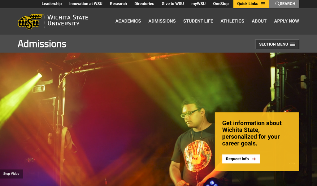
This Wichita State University website review is focused on the undergraduate admissions website from the two vantage points that matter most to enrollment: the prospective student and the parent. Wichita State generally makes it easy for families to reach the information they need, and much of it is executed well. What is most notable is that the one area families weigh most heavily, cost, is handled with unusual directness, placed right where a shopping family would look. The clearest opportunities are about speed and consolidation rather than absence.
Wichita State University at a glance
- Location: Wichita, Kansas
- Type: Public research university (Kansas Board of Regents)
- Founded: 1895
- Total enrollment: 10,000-15,000 students (main-campus undergraduate)
- Athletics: NCAA Division I, the American Athletic Conference; nickname the Shockers.
Summary of Wichita State University Website Review
Clear strengths
- Cost lives where families look for it. A dedicated Tuition and Fees page sits directly in the undergraduate admissions section menu, one click from the admissions landing page. It carries a real estimated-expense table, a net price calculator link, and a cost of attendance link. This is the single hardest task for most university sites, and Wichita State handles it without interruption for the user.
- Branding is bright and colorful without being a distraction. The Shockers have yellow as a primary color, and the website balances it well while not shying away from it or creating accessibility contrast issues.
- The primary funnel actions are relentless. Apply, Visit, and Request Info links appear in the header, the body, and the footer of nearly every admissions page, so a ready family is never more than a glance from the next step.
- Program discovery is thorough and well organized. The majors and minors listing offers links to show program by level and format (undergraduate, graduate, online, certificates, badges) and multiple views, including by college, alphabetically, and as degree maps.
- Audience routing is explicit. The admissions landing page sends transfer, adult, graduate, and professional audience visitors to paths built for them, respecting how differently each group shops.
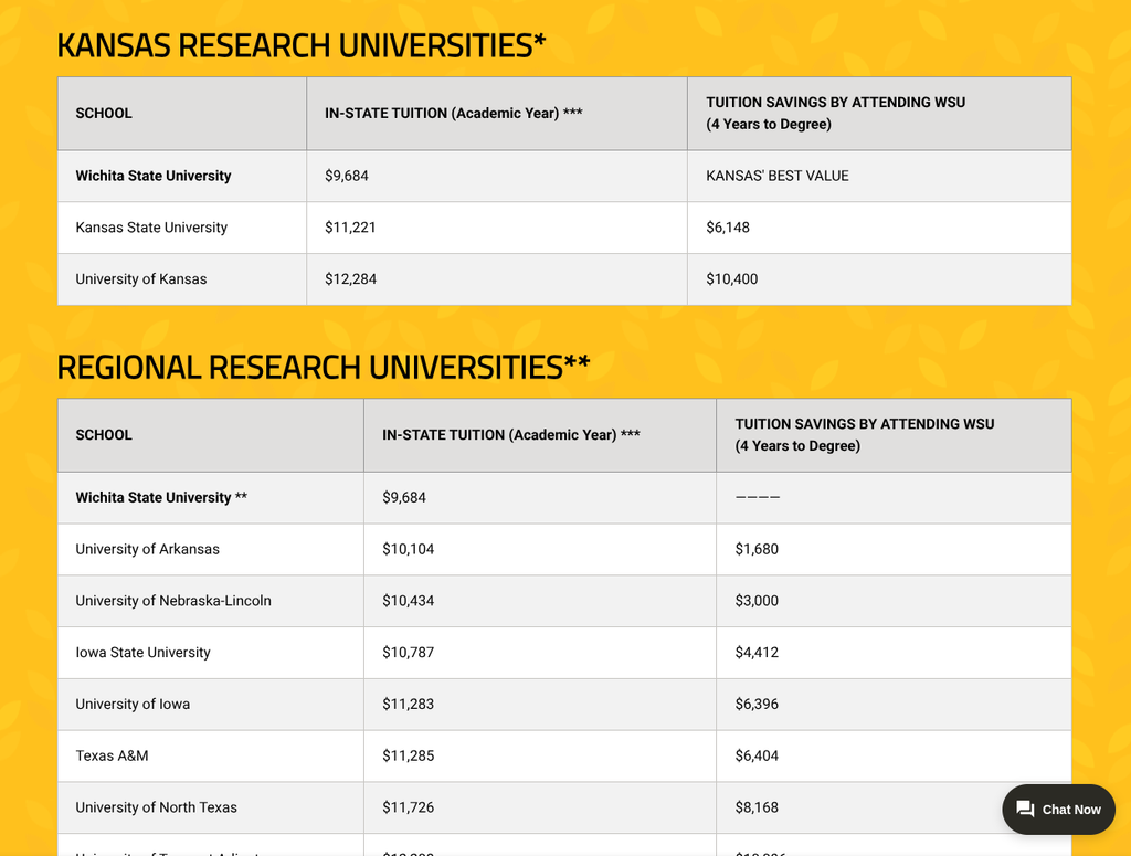
- Value is a stated theme. Affordability messaging, tuition discounts for a dozen neighboring states, and a Shocker Value comparison page reinforce a message families are actively weighing, and a Spanish-language admissions path is present.
Strategic opportunities
- Program discovery relies on scanning, not searching. The majors list is a long alphabetical page. A decided student must still scroll or use the browser’s find function, and there is no on-page typeahead or site-wide program search that surfaces a major from a deep interior page. The information is available, but sorting through the filters felt less refined than expected.
- The cost picture is spread across several good pages. Tuition and Fees, Shocker Value, tuition discounts, cost of attendance, and the net price calculator are each strong on their own, but a family assembling one number has to visit several places and hold the pieces in their head.
- The application journey crosses several destinations. Applying moves a visitor from the main site to a separate application portal, which is a common practice. Request Info goes through through a Slate page. The handoffs work, but the visuals could be more consistent. When using multiple platforms the inconsistent look can take away from the overall experience.
- Admission requirements are dense on the page. The expandable requirement blocks pack a great deal of conditional detail into one view. This serves the exception cases but can slow the typical first-year applicant looking for the one line that applies to them.
- Total-cost consolidation would elevate an already strong section. There is no single family-facing “what will this cost” hub that unites the estimate, calculator, discounts, and aid into one guided view.
Technical foundations
Wichita State’s public site runs on the Omni content management system. Admissions inquiries are handled through Slate, and undergraduate applications route to a dedicated application portal, with the Common App available as an alternative. This is a capable, common stack for a public research university, and it supports the consistent header, footer, and section-menu patterns that make the site feel coherent across many pages. The footer carries the expected accessibility, privacy, nondiscrimination, and Title IX links, indicating an established governance posture.
Lighthouse scores are respectable all around, with some work to do on the performance of the site. SEO scores of 100 on Admissions are an impressive accomplishment.




Information architecture and findability
The admissions section is coherent and easy to move through. A section menu keeps the tasks a family cares about, apply, majors, tuition, visit, requirements, housing, scholarships, and financial aid, together in one predictable place, and the primary funnel actions repeat throughout. A prospective student is never stranded, and the audience-routing links let transfer, adult, international, graduate, and military visitors step onto a path built for them.
Program discovery is where the architecture is strongest in coverage and weakest in speed. The majors and minors page is genuinely well structured, with filters by level and format and a choice of viewing by college, alphabetically, or as degree maps. Majors are labeled the way students think of them (“Aerospace Engineering,” “Game Design,” “Nursing”) rather than in internal department language, which is user-priority design working as intended. The friction is for the decided student: the alphabetical list is long, and there is no search-as-you-type field and no site-wide program search that follows the visitor onto interior pages. A student who lands deep in the site and wonders “do they have cybersecurity?” cannot answer that from where they stand. A single typeahead field at the top of the majors page, mirrored in the site header, would turn a strong catalog into a fast one and shorten the most common path a decided student takes.
Cost, financial aid, and transparency
Cost is often the center of the decision for families, and it is where Wichita State most distinguishes itself. Tuition information is sometimes tucked under administrative or student-account branches, far from where a prospective family would think to look. Wichita State is a refreshing counterexample. The Tuition and Fees page appears in the undergraduate admissions section menu itself, exactly where a shopping family expects it.
The page rewards the visit. It presents an estimated expense table for the coming academic year covering tuition by residency, required fees, parking, room and board across three residence halls, and books. It links to a net price calculator and a cost of attendance page, and it is honest that rates change year to year. For a family trying to answer “what will this cost us,” most of the raw material is here and framed plainly.
The opportunity is consolidation. The full cost story is distributed across the Tuition and Fees page, the Shocker Value comparison, the tuition discounts for neighboring states, the cost of attendance page, and the net price calculator. Each is useful. A family assembling one number, though, must move among several pages and carry the pieces along the way. A single “What will Wichita State cost me?” page living inside the admissions section, leading with total cost of attendance, then the calculator, then aid and scholarships, then the tuition detail, would let a parent answer the entire question in one place, in under a minute. For enrollment leadership weighing where to invest, that one change would likely move conversion more than any full redesign.
Accessibility, usability, and inclusivity
Wichita State sends welcoming, inclusive signals. The audience-routing links speak directly to transfer, adult, international, graduate, and military or veteran students, and a Spanish-language admissions path is a thoughtful gesture toward the institution’s region and its families. An Accessibility link is present in the global footer, alongside privacy, nondiscrimination, and Title IX notices, a sound baseline that many peers do not surface as clearly.
Two considerations would strengthen the usability picture. First, the density of the expandable admission-requirements content merits a pass for the typical applicant, so the common case reads first and the many exception cases sit below it. Second, as with any content-rich site, the interior program and cost pages benefit from periodic keyboard and screen-reader checks, since long lists and embedded tools are frequent places for accessibility gaps to hide. Both are efficient wins relative to their reputational and compliance value.
Executive lens: enrollment, risk, and governance
Enrollment and funnel. The awareness-to-application path is strong: programs are findable, Apply and Visit are ever-present, and the affordability message is confident and early. The upfront treatment of cost is a genuine competitive advantage in a market where families decide on value early and quietly. The refinements sit at the top and middle of the funnel: a faster program search shortens the discovery step where interest becomes intent, and a consolidated cost view addresses the most common reason a strong prospect stalls.
Risk and compliance. The posture is solid, with a footer accessibility link and standard notices in place. The primary considerations are routine: keeping content-heavy pages accessible as they grow, and ensuring the several connected systems for inquiry and application remain clearly signposted so a visitor always knows which system they are entering.
Governance and maturity. The distributed cost pages and the several application front doors reflect the familiar higher-education reality of multiple offices owning adjacent content. This is a coordination opportunity more than a technology problem, and organizing around the family’s priority rather than the office’s boundary is where the real value is created.
Recommendations
- Add a program search-as-you-type to the majors page and mirror it in the site header, so a decided student can reach a program from anywhere in one action.
- Build one family-facing “What Wichita State costs” page inside the admissions section: total cost first, then calculator, then aid and scholarships, then the tuition detail.
- Surface the next available visit dates directly on the Visit Campus page to convey momentum before the click.
- Streamline the admission requirements view so the typical first-year applicant sees the line that applies to them first, with exception cases available but tucked below.
- Protect and elevate the wins. The upfront Tuition and Fees placement and the affordability messaging are assets worth featuring even more prominently.
An invitation to collaborate
The intent of this series is to help institutions serve students and families better in a spirit of collegiality and support. Wichita State has built a capable, welcoming admissions site that treats cost with a candor many larger institutions have not matched, and the opportunities identified here are the kind every college or university faces. Enrollment and marketing leaders who would value a deeper, institution-specific audit are warmly invited to reach out, as is anyone who spots something this review has gotten wrong. Corrections are always welcome and will be reflected promptly.
Want to work together? Get in touch.
Disclaimer: This review is based on publicly available information at a specific point in time and reflects professional opinion offered constructively. Websites change frequently, and details may have shifted since publication. Institutions are welcome to submit corrections or updates, which will be incorporated promptly.